Are you feeling sluggish when studying, or less productive at work? Colour psychology tells us that it isn’t just the lack of coffee that affects our productivity. The colours you choose for your surroundings can have a big impact on creativity, concentration, and efficiency.
One of the most important things to note when choosing colours for your environment is the intensity of the colour. “A strong bright color will stimulate, and a color with low saturation will soothe,” says world-renown color psychologist Angela Wright. The four psychological primary colours are: red, blue, yellow, and green. And they affect the body (red), the mind (blue), the emotions, the ego, and self-confidence (yellow), and the essential balance between the mind, the body, and the emotions (green).
Orange for Concentration
Put away that glass of orange juice. Orange is a vibrant, energizing hue that will stimulate focus, concentration and promote organization, making it the perfect colour to boost productivity in the workplace. If you’re not keen to go all orange on the walls, try adding elements of orange such as a feature wall, art pieces, pillows, chairs, tables and other furnishings in shades of orange.

Orange-inspired workplace
Blue for Mental Stimulation
Blue is the universally recognized ‘office productivity colour’. That is true, as blue can help to stimulate your mind and at the same time allow you to concentrate for longer periods of time, unlike attention-grabbing hues like orange or red. However, having too much blue in the workplace may feel rather monotonous (there’s a reason why it’s called Monday Blues), so you might want to balance it out with some pops of orange or yellow.
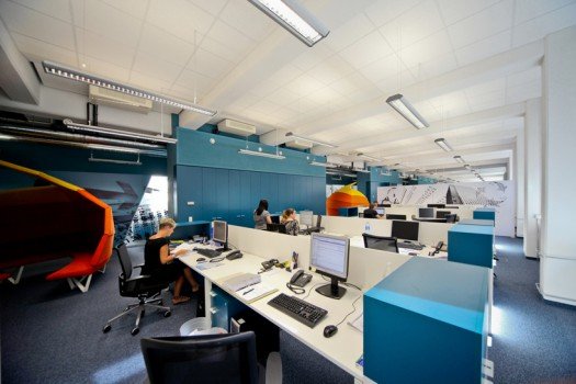
Blue office inspiration
Yellow for Creativity
For creative types like stylists and designers, yellow is a much better choice than orange or blue, as it stimulates the ego and increases optimism. Happily optimistic people are more likely to think creatively and be inspired by new ideas.
So maybe that’s why the oh-so-popular Minions are yellow, their love for bananas not withstanding.
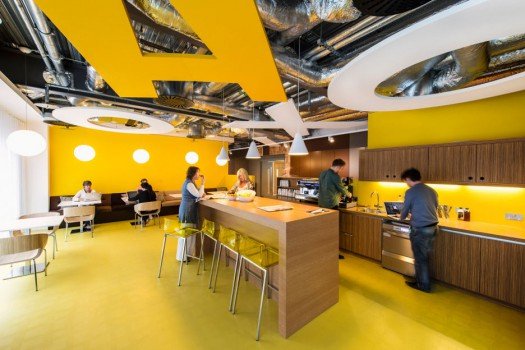
Google office in Dublin
Other colours
Neutral shades like white, grey, and (light) brown are a staple in most places, as they are unobtrusive and complement other colours very well. Red, although highly energizing, is not a colour that most people would use to paint their office or workplace, as it stimulates physical strength, competition, and aggression. Green is also an uncommon choice, because even though it is a calm and balanced colour, it may seem dull or uninspiring after a while.